Brand Identity | Graphic Design | Business Strategy

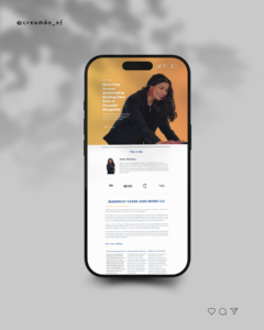
Jesica marenco | ceo
MARENCO TAXES AND MORE LLC
Driven by a mission to empower others through financial education, Jesica is committed to sharing their expertise and insights to help individuals and businesses make informed financial decisions.
Connect with Marenco Taxes and More
You Bring the STory, We Build the Brand
Marenco Taxes and More LLC are seasoned financial professionals with a strong passion for empowering individuals and businesses through expert guidance and deep-rooted community engagement. Based in the Bay Area, they work closely with entrepreneurs and small business owners in the Mission District, Excelsior neighborhoods, and beyond. Their reputation as a trusted financial ally continues to grow thanks to their personalized approach and commitment to helping their clients thrive.
Main Logo

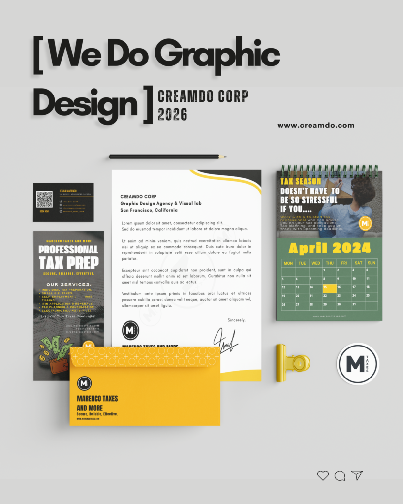
Biz Cards

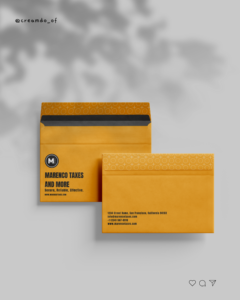
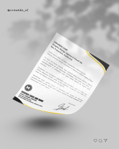
Stationary
Cultural Sensitivity
Our roots as immigrants shape our understanding and appreciation for diverse cultures and backgrounds. We approach every interaction with cultural sensitivity and respect, recognizing the unique challenges and perspectives of each individual and community we serve
Community Empowerment
We believe in the strength and resilience of communities. With over 15 years of experience serving the Bay Area and surrounding areas, we are deeply committed to empowering local communities, particularly small businesses, and women-owned businesses.



How it started?
When Marenco Taxes and More reached out to our agency, they were in the early stages of formalizing their business. However they already have clear vision of what they wanted to do with their identity and the direction of their path. They had a logo sketch, created by the founder’s daughter, which carried deep sentimental value. While they had been using it as a placeholder, they were now ready to launch their brand into the market with a professional and unified visual identity.
Their request was clear: create a brand identity based on the existing sketch, preserving its emotional essence while transforming it into a powerful and professional brand.
Respecting the personal meaning behind the original sketch, we took a thoughtful and strategic design approach. Our goal was to reinterpret the existing concept into a clean, modern, and visually cohesive brand identity, maintaining the spirit of the original while elevating its aesthetic and professional appeal.
We focused on a monogram-style logo, merging it with an iconic brandmark (imagotype), resulting in a versatile and contemporary design. The color palette, yellow, orange, and white was chosen to reflect energy, optimism, and trust, all key attributes in the financial and community service space.


Respecting the personal meaning behind the original sketch, we took a thoughtful and strategic design approach. Our goal was to reinterpret the existing concept into a clean, modern, and visually cohesive brand identity, maintaining the spirit of the original while elevating its aesthetic and professional appeal.
We developed an Emblem Monogram logo (an initial within a seal), aiming for maximum memorability and versatility. The double-circle shape functions as a seal of guarantee. It symbolizes wholeness, precision, and comprehensive service (the “More”). This closed container conveys stability and the feeling of an established, secure brand. The “M” dominates the center. We used an ultra-bold, geometric sans-serif typeface. Its visual weight is intentionally high to convey strength, stability, and undeniable leadership. It serves as the brand’s primary anchor.
SECURE RELIEABLE EFFECTIVE
The client was thrilled with the results. The final brand identity honored the emotional significance of the original design, while empowering the business with a polished, professional visual presence.
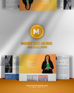
Since launch, Marenco Taxes and More has used their new branding across:Educational materials, Custom t-shirts, Printed documents, Workshop presentations, Their website and social media platforms.
Ready To work with us?
Send Us a message today, and let's make that idea become reality!
